The Darkest Phase of the Bear

With Bitcoin prices selling off to the mid-$20ks, a plethora of macro indicators suggest the market is entering the deepest phase of this bear cycle. Fundamentals have deteriorated, and even Long-term Holders are now realising significant losses.

The Darkest Phase of the Bear

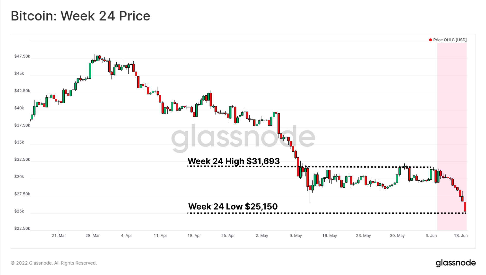
Bitcoin and digital assets have experienced yet another chaotic week of downside price action, losing the open of $31,693 and trading down to a new multi-year low of $25,150. Macro headwinds remain a large scale driver, with the latest US CPI print of 8.6% being above expectations and another 2y-10y US Treasury Bond yield curve inversion occurring in the early hours on Monday. This has been met with a large rally in the DXY, as Bitcoin closes with its 10th red candle in 11 weeks.

Bitcoin network utility continues to languish, with macro metrics like the RVT entering the uncharted bearish territory. Despite continued accumulation across Shrimps (< 1BTC) and Whales (> 10k BTC) alike, price support remains far from established. Despite many macro valuation metrics continuing to flag oversold conditions, Bitcoin remains correlated with traditional markets, with prices taking a beating accordingly.

In this edition, we explore how the current bear market is now entering a phase aligned with the deepest and darkest phases of previous bears. The market on average is barely above its cost basis, and even Long-Term Holders are now being purged from the holder base.

Translations

This Week On-chain is now being translated into Spanish, Italian, Chinese, Japanese, Turkish, French, Portuguese, Farsi, Polish, Hebrew and Greek.

The Week Onchain Dashboard

The Week Onchain Newsletter has a live dashboard with all featured charts available here. This dashboard and all covered metrics are explored further in our Video Report, which is released on Tuesdays each week. Visit and subscribe to our Youtube Channel, and visit our Video Portal for more video content and metric tutorials.


A Meeting With The Cost Basis

With the market trading into the mid-$20k region, it is approaching one of the most significant and fundamental on-chain metrics, the Realized Price. This metric represents the average price of every coin in the supply, valued at the time it was last spent on-chain.

The Realized Price (at $23,430) is rarely visited by spot prices outside the deepest and latest stages of bear markets. March 2020, and the end of the 2018 bear market were the last instances where the market was on aggregate holding an unrealized loss.

Live Chart

The MVRV Z-Score then compares this spot value of Bitcoin against Realized Price to obtain an oscillator. This tool can help to identify statistically meaningful deviations away from this ‘intrinsic value’ and is used to assess over and undervalued conditions.

Values equal to the mean (black line) typically align with these deep late stage bears. The current market has now fallen to just +0.26 standard deviations above the mean, which historically would be considered a value zone, especially so when weighted for an upwards drift in Z-score.

Nevertheless, past bear cycles have shown that negative MVRV-Z values are often seen before a bear market concludes and can persist in that state for some time (order of months in 2018 to a year IN 2015).

Live Workbench

Bitcoin HODLers Soften Up

Within the structural downtrend that has been in place since November, we have seen a variety of behavioural phases and Bitcoin spending behaviour taking place. We can use these changes in behaviour to gauge how aggregated investor sentiment has changed.

The Accumulation Trend Score is a useful tool to observe these changes by assessing the magnitude and duration of on-chain Bitcoin balance growth or contraction. It displays the aggregate accumulation/distribution weighted for all cohorts.

  • Dec 2020 to Jan 2021 - Bull market buying, as investors entered the market and created the bullish impulse to the then $64k ATH.
  • Jan 2021 to Oct 2021 - Softening and general distribution, in part a result of declining spot demand after the GBTC premium turned to a discount (covered in our report here)
  • Oct 2021 to Jan 2022 - Post ATH buying demand which was later redistributed (as covered in Week 9, 2022)
  • Jan 2022 to May 2022 - Intermittent accumulation and distribution, culminating in the LUNA-UST motivated sell-off (as covered in Week 20, 2022).

In the current market, we have seen one month with an Accumulation Trend Score north of 0.8, signifying high positive balance changes across the market. This is a notable shift from the intermittent accumulation before the LUNA sell-off and may suggest an improved investor perception of value at prices at and below $30k.

Live Workbench

We can also look toward the Liveliness metric to understand the market preference for HODLing or distributional behaviour. Liveliness defines the balance between aggregate Coin Day Destruction and Coin Day Creation. It can therefore be used to provide confluence with destruction and accumulation regimes.

Liveliness has remained in a structural downtrend since August 21. Bitcoin is firmly within a regime of aggregate Coin Day Creation as HODLing dominates. However, as we have explored in previous editions, with only the HODLer class remaining, their demand side remains too light to contain the current action sell-side.

Live Chart

We can further confirm this by assessing the 3-month position change for Liveliness (shown in purple below). A general accumulation range can also be highlighted since the Great Miner Migration in Jul 2021. However, this Coin Day Creation regime is losing momentum and trending toward an equilibrium position based on the current trend. This reflects the general uncertainty in markets, which is resulting in increased investor de-risking of spot positions.

Live Workbench

The HODLer net position change brings these observations into the supply domain, and can be used to estimate the magnitude of coin volume HODLer base is accumulating or distributing. This metric indicates that based on the degree of coin dormancy at present, approximately 15k-20k BTC per month are transitioning into the hands of Bitcoin HODLers. This has declined by around 64% since early May, suggesting a weakening accumulation response.

Live Chart

We have seen changing phases of investor conviction and spending behaviour over the last 18-months. In particular, we have identified that in both instances at the $30k level (May-July 2021 and currently), the investor buy-side sentiment appears to be stronger than any other price level in this cycle.

A Bifurcated Market

We have established that investors do appear to perceive value in the sub-$30k region, despite this demand being insufficient thus far in providing price support. Next will break down which cohorts have been participating in the accumulation to further refine these observations.

The Trend Accumulation Score by Cohort allows a more granular assessment into which wallet-size cohorts are accumulating/distributing and to what degree.

  • Shrimps (<1 BTC) and Whales (>10k BTC, excl. exchanges and miners) cohorts have been aggressively accumulating since the price slump into the $25k-$32k range. This remains in effect throughout the last 2 months of depressed prices.
  • Crabs to Sharks (1 to 100 BTC) cohorts have transitioned from a neutral to a distributive phase during the current sell-off. This suggests a potential decline in confidence.

Thus the near-perfect scores of 0.9+ seen in the Accumulation Trend Score over recent weeks are being driven by the very large (>10k BTC) and relatively small (<1 BTC) cohorts. It is interesting to note that the whale entities were the driving distributors at the $45k to $35k levels (Zone A) and are currently one of the prime accumulators in the $25k to $32k range (Zone B).

Live Metric in the Glassnode Engine Room

Next, we can assess the 30-day rate of change of supply held by shrimp addresses with less than 1 BTC. The 30-day rate of change provides insight into the raw position change to the number of coins held by this smaller and likely retail-level cohort of investors.

Although the current rate of balance growth is waning, it was preceded by the most aggressive and consistent accumulation period post-Bitcoin’s initial rise in the last 18-months. These smallholders have seen a net balance growth of +20,863 Bitcoin since the May 9th Luna crash, providing confluence with Accumulation Trend Score by Cohort.

Live Workbench

On an absolute magnitude basis, Shrimps have added +96.3k BTC to their holdings since the Nov ATH. This equates to 0.451% of the circulating supply, and 48.6% of new coin issuance over the same period.

We can visibly see the steepening positive gradient of shrimp owned supply. These small holders appear unfazed, rightly or wrongly, by the prevailing downtrend, as they continue to constantly accumulate spot BTC.

Live Chart

The other cohort of interest to assess is the 10k+ BTC Whale cohort. Looking at the monthly position change of their addresses, we can support our previous observations that the cohort has also been accumulating throughout the $25k-$32k price range. This cohort has a monthly position change peak of ~140k BTC/month, increasing their balance by adding +306,358 BTC since the Nov 2021 ATH.

Live Workbench

The Entity-Adjusted Unspent Realized Price Distribution by wallet cohort examines the price points where this supply distribution was last transacted, and by which wallet cohort.

Around the $30k and $40k price buckets, we can see significant supply clusters associated with a diverse range of wallet cohorts, indicating these two price ranges experienced significant volumes of supply changing hands. However, there is little coin volume transacted between $27k and $20k, which may manifest as a region of high volatility, and potentially little support.

Live Chart in the Glassnode Engine Room

The Deterioration of Fundamentals

The RVT Ratio compares the Realized Capitalization against the daily volume settled On-Chain, this provides insight into the daily utilization of the network (On-Chain volume) relative to its intrinsic value (Realized Cap). A general framework for the interpretation of the RVT is:

  • High values and uptrends indicate poor utilization and a slow-down in-network utilization.
  • Low values and downtrends indicate high utilization and an uptick in-network utilization.
  • Stable sideways values indicate that the current utilization trend is likely sustainable and in equilibrium.

The red band denotes an RVT ratio of 80 or above, suggesting the network valuation is now 80 times larger than the daily value settled. This is indicative of a barren on-chain activity landscape, which is historically a result of extended bearish price action, flushing cost-sensitive participants from the network.

In past bear cycles, an underutilized network has provided confluence with bear market bottoms. Should network utilization increase and RVT manages to break lower, it may signal improving fundamentals. However, with the RVT ratio currently at its highest value since 2010, a continued break higher would enter the somewhat uncharted bearish territory, where network valuation is even more 'overvalued' relative to network activity.

Live Workbench

The Entity Adjusted Dormancy Flow model can also be used to compare Market Valuation to network utilization from the perspective of the average coin age being spent in the network. Dormancy measures the average amount of Coin Days Destroyed on a per coin transacted basis. Dormancy Flow then compares the Market Capitalisation to Dormancy (in USD terms), thus capturing deviations in spending behaviour against the market valuation.

Dormancy Flow continues to trade at historical lows, suggesting that the market valuation is low relative to the time weighted on-chain transaction volume. Previous instances of Dormancy flow at these levels have typically coincided with bear market capitulation events and periods of maximum pain.

In line with the weakening Liveliness and HODLer performance, this aligns with a condition where even the oldest Bitcoin holders were purged from the network.

Live Chart

A Purging Of Even the Strongest Hands

Long Term Holders and Short Term Holders are dichotomous by nature and thus value different things.

  • Short Term Holders are statistically more sensitive to price volatility, as their cost basis is much closer to the current spot price.
  • Long Term Holders generally represent the HODLer cohort, whom are relatively price-insensitive. This cohort is more likely to weather volatility and price drawdowns in the pursuit of long term value (covered in last weeks edition).

The Spent Price is a model that represents the average cost basis of coins that were spent each day. This can be split to analyze the LTH and STH components to identify divergences between their spending behaviours. It is uncommon for the LTH cohort to spend coins with a higher average cost basis than their sister STH cohort, however this does occur when entering a deep capitulation zone, where even the strongest hands are purged from the asset.

The chart below compares the spent price of LTH to STH, and we can see that LTHs are currently spending coins with a higher cost basis than STHs. Previous instances of this have coincided with deep bear market finales, lasting between 52-days (2020) and 514-days (2014-15) and accompanied by additional drawdowns in the price of -40% to -65%.

Live Workbench

Comparing the aggregate market cost basis (Realized Price) to the LTH-Cost Basis shows that the two are currently converging. The LTH cohort usually has the lowest On-Chain cost basis, and this directly ties in with their trading ideology of buying low prices in value zones thus, their aggregate purchase is lower.

Therefore, with the LTH cost basis approaching the aggregate cost basis (from below), it is an indication that the current holdings of the 'smart money' cohort have not outcome the broader market. Previous instances where LTH Realized Price is higher than aggregate Realized Price also coincide with the deepest phases of a bear market.

Live Workbench

Summary and Conclusions

The Bitcoin market has entered a phase coincident with the deepest and darkest bear cycles of the past. Prices barely hold above the aggregate cost basis as captured by the Realized price, and on-chain volume fundamentals have deteriorated further. Historically, this phase has taken on the order of 8 to 24 months to pass by as the market hammers out a final bottom.

Of the highest note is that Long-Term holders are currently spending coins with a higher cost basis than Short-Term holders, and their cost basis is barely more profitable than the aggregate market. In the past, this has signalled the start of the final and painful wash-out phase of all remaining sellers, unfortunately, accompanied by a further 40% to 64% price decline.

All eyes are on the conviction and support provided by the Bitcoin HODLer class now.


Product Updates

All product updates, improvements and manual updates to metrics and data are recorded in our changelog for your reference.

  • Release new dashboard for pro users: GN engine room
  • Added 5y zoom option to dashboards metrics cards.
  • Improvements applied to Workbench if function.
  • Simplified save actions on the Workbench page and added on-click Price option.
  • Uncharted Newsletter Edition #17 released.

Disclaimer: This report does not provide any investment advice. All data is provided for information purposes only. No investment decision shall be based on the information provided here and you are solely responsible for your own investment decisions.